Photographer Oleg Ti knows light. He also knows how to share that knowledge. In this post he will use the D1 monolight to show us how to do hard light portraits. Keep reading. You won’t regret it.

The most difficult thing in photography is to develop your own method or “algorithm of behavior” during the shoot. Everyone has the same challenge, but the result is different – primarily because the decisions made by each individual are different, even under the same conditions. I believe that the main value of any photographer is not just in his skill set or knowledge base, but in the way that he applies it.
In the workshops I host, I am often asked why I chose this source of light, why I chose this way of lighting, this position of light, the power, direction etc etc. And often I answer: I do not know, because the process is intuitive, instinctive. But we all know that intuition is also “skill set,” one that totally unique to you.Trying different ways of lighting, searching for your own unique approaches, arguing with yourself and, ultimately finding your own solutions and methods – that is what will make you and your work better.
Methods don’t happen immediately. They are formed over time, via accumulated experience, experimentation, and the knowledge that is collected as a result. And, in my lessons, I try not to just give you the information on how this was made, but to also impart to you my thought process to help you to build your own.
I always like to re-experience the great pleasure of shooting a portrait with hard light. It is an opportunity to enjoy playing with light, shapes, shadows and beauty of the model. So, here it is – the best way to understand what goes into hard light portraits. Let’s begin!

Key Light
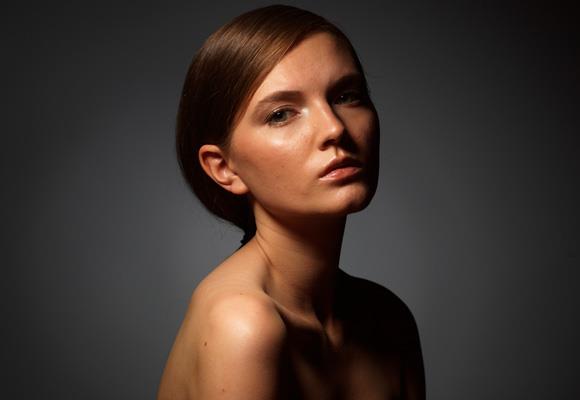
At first, I took key light and directed it to the model.
What you get is very harsh and contrasty – deep shadows and a black background behind the model. For the above image, I used a D1 monolight with a Zoom Reflector and a honeycomb grid and diffusion gel at a distance of around half-meter (approx. one-and-a-half feet) from the model’s face.
It is so contrasty because the very narrow beam of light produced by honeycomb grid doesn’t hit anything but the model – no walls, no background, no ceiling. Moving the light away from the model would result in less contrast, because of light reflecting off of the surrounding surfaces, and the light becoming harder and harder. Yes, the closer the light, the softer it is. (One has to remember not to confuse the hardness of light and the contrast of light.)
As the main goal of the key light is to light the main part of the picture, I have to think here about its position and the position of the model’s face – not about the contrast and shadow detail. This is why I like to start with the hard key light only, moving it around, looking at the model, and understanding what position would suit her.
And only then, after having found that ideal position can I begin to think about the other elements of successful portrait: shadow, background, colors, emotions. Let’s work through the process step-by-step.

Background Light
We usually don’t use DOF (depth of field) in a studio environment. Unlike outdoor/environmental shooting, there is nothing to blur behind the model (by opening the aperture) in the studio. We have only a white or gray background. So, using an aperture of, say, f/2 will only reduce the sharp parts on the face and will not blur the background.
In the studio, we usually form the “volume” of the image with the pattern of the light, especially of the background light. This is why I treat with the background light so tenderly and carefully. This is the volume of the image, a compositional perfection, this is simply your aesthetics. In trying to get a dramatic picture, it seems to me that here a spot of light behind the model would be the best solution – not behind her head, but slightly lower, behind her neck. Like in the image above.
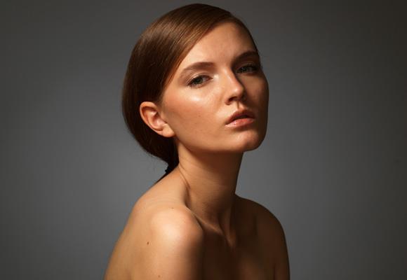
The position of the light spot is chosen correctly, but the amount of light is not enough. The background light is barely visible against the bright light on the model. It is simply lost. So I increase the power…


…which is too much. It becomes not only brighter but also “larger,” volumewise I don’t need the background light that dominates in the picture. So, I in the second image I decreased the power a little bit.

Fill Light
In most cases, except for radical pictures for which I need only absolutely dark and bright areas, I use fill light. The task of fill light is to show us details in shadows – not to light shadows, but to give a little information about these areas. When the fill light becomes more powerful than the key light, we can say that they have changed roles, where the fill light becomes more powerful and begins to serve as a key light. To get the fill, I use standard reflector, aimed at the wall behind me. This is a good way to get a soft fill light coming from the camera – (the best of his property and location).
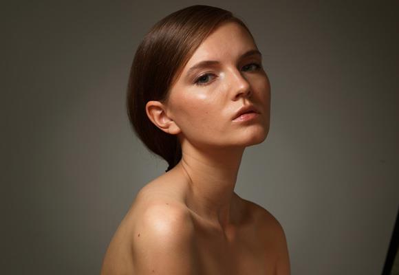
In this picture, the fill light is set to 3-stops lower than the key. You see that its presence is barely noticeable – the overall picture has not changed. However, it is very different from what it was in the picture without the fill light. Now we have details, texture, and information in the shadows. For me, though, it is still not enough for the type of picture I need. So In the images above I added one stop to the fill light.
Plus one stop more:

And, finally the maximum power of my D1:

Now the picture now looks high-key. The power of the fill light is very close to the power of the key light and the key light is barely visible. Here, it has to be said that you see the sample of portrait that is taken with only hard light sources. But notice what a well-lit, and, at first sight, very soft picture we’ve got. But at the same time very volume and beauty. However, here the power of the fill light is above my expectations.
I choose to lower the power by 1.5 stops. As in the picture below:

But I have to add that it is not because some “rule.” It’s purely an artistic call, made because of my expectations of the style of image, because of my aesthetics and experience.

Gel on the Key Light
Now let’s make the picture warmer. I don’t like how the gray neutral background works with work tone of model skin. And I want to make the background a little bit warmer. And it would be better to make the fill light warmer, as it will paint the shadows with more warmth, more saturated color which will look better in the final image.
However, I have to do it very delicately, I don’t need significant amount of change. To achieve it, I use an unusual solution: I put a 203 (Cool Conversion) gel on the key light source. This is a very weak conversion gel, which is designed for fine correction of color temperature. However, in this case, it’s all we need!
You can see that the areas where the key light works become a little bit cooler. The expected effect, which we will turn in our favor.
I change the color temperature of raw-converter from 5600K to 6200K, approximately for the difference to compensate using of cold 203 gel on the key light. And the key light becomes neutral. But now, all of the light sources without gels immediately become warmer.

Look at the picture above and you see the corrected color temperature. The skin of the model still has the basic color as we had in initial pictures, but the background and the shadows have become warmer. This is the expected effect – and so easily accomplished in this picture.

Rim Light
Now let’s add a Collapsible Reflector. Here, I use the Collapsible Reflector not as a source of the fill light (how amateur photographers generally use it), but as a source for the rim light. I always put a little light reflector behind the model, trying to catch such reflection of the key light to give volume to the shadow side of model’s face. Generally, the use of the Collapsible Reflector is not a prerequisite for a good portrait. In many cases it even interferes more than it helps, which begs the question, “is it needed for this picture at all?” Sometimes it’s better to just leave the dark shadows.
Look at the picture above. We’ve lost the volume. The rim light works here rather as an additional fill light source. And I move it further behind the model…

…we barely see it. It isn’t working well, so I need more a visible lighting pattern. And that is why I add the lighting source to our lighting setup.

Additional Rim Lighting Source
To solve the problem, I add a fourth Zoom Reflector with honeycomb grid. I use the honeycomb grid for making the spot of light narrower, which will help me to direct it only to the surface of light reflector, not to the model’s face. This will help me to change the power and position of the rim light, despite how the key light works.
In the picture above, you can see that the relative power of this light source is just too much. We haven’t got a thin elegant line of light on the shadow side of the model’s face. But we’ve got a strong, wide, distracting lighting spot.
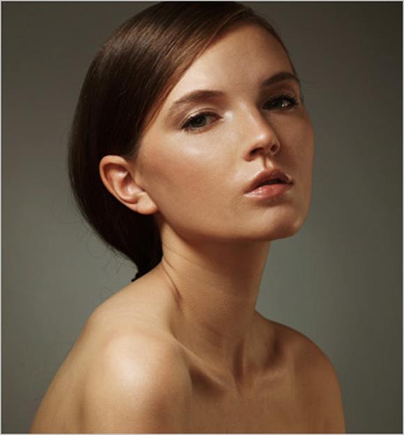
After trying several positions for this lighting, I found the one below. The position and power work perfectly in this picture, so I stay with it.

So, look! We’ve got very nice, warm, aesthetic portrait, with great volume, which is made only with hard lighting sources.
Good Luck!
See more of Oleg’s beautiful work at his website.
To learn more about the D1 that he used for this shoot, click here.